
What is Figma?
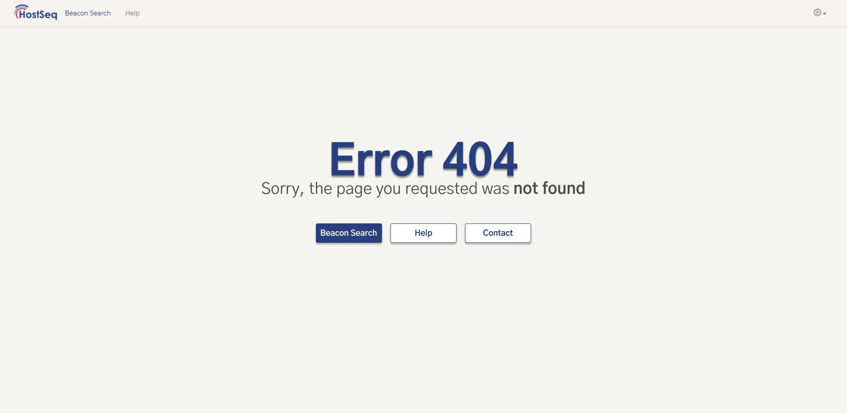
Figma is a collaborative tool built with designers in mind; it allows for multiple people to work together on a design file. It can be used for many design workflows, but is primarily used in the conception or brainstorming phases as well as for high and low fidelity prototyping. Perhaps the most useful feature of Figma is that it allows for seamless collaboration by multiple users on a project. This helps in getting fast feedback from clients as well as fast iteration development and testing. Its usefulness in development goes further, allowing for designers to directly export generated CSS/IOS/Android code for the designs made. For example while I worked on the HostSeq Error 404 page (see below) I was able to pull out the CSS for design from a Figma file I was working on, however some edits needed to be done to remove exact sizing and to convert from pixels to relative sizing.
Figma provided CSS for Beacon Search and Help buttons
    /* Beacon Search */

    position: absolute;
    width: 129px;
    height: 23px;
    left: 726px;
    top: 518px;


    font-family: Gothic A1;
    font-style: normal;
    font-weight: bold;
    font-size: 18px;
    line-height: 22px;
    /* identical to box height */


    color: #FFFFFF;


    /* Rectangle 2 */

    position: absolute;
    width: 150px;
    height: 44px;
    left: 885px;
    top: 507px;


    background: #FFFFFF;
    border: 1px solid #283E7D;
    box-sizing: border-box;
    box-shadow: 0px 4px 4px rgba(0, 0, 0, 0.25);
    border-radius: 4px;


    /* Help */

    position: absolute;
    width: 40px;
    height: 23px;
    left: 940px;
    top: 518px;


    font-family: Gothic A1;
    font-style: normal;
    font-weight: bold;
    font-size: 18px;
    line-height: 22px;
    /* identical to box height */

    color: #283E7D;
Converted CSS for HostSeq Page
/*404 Error Page*/

.text-navy {
    color: #283E7D;
}

.font-gothic {
    font-family: "Century Gothic", CenturyGothic, AppleGothic, sans-serif;
}

.textShadow-grey {
    text-shadow: 1px 3px #4f4f4f63;
}

.navy-button, .outline-navy-button:hover, .outline-navy-button:hover a  {
    background: #283E7D;
    border: 1px solid #283E7D;
    box-sizing: border-box;
    box-shadow: 0px 4px 4px rgba(0, 0, 0, 0.25);
    border-radius: 4px;
    color: white;
    text-decoration: none;
    width: 9em;
}

.outline-navy-button, .navy-button:hover, .navy-button:hover a, .navy-button:active a  {
    background: white;
    border: 1px solid #283E7D;
    box-sizing: border-box;
    box-shadow: 0px 4px 4px rgba(0, 0, 0, 0.25);
    border-radius: 4px;
    color:#283E7D;
    text-decoration: none;
    width: 9em;
}
Advantages
- Free (for up to two users and three projects but you can circumvent this limit by utilizing drafts)
- Browser based and runs on Windows, Mac, Linux, and Chrome
- Allows for real time collaboration
- You can import sketch files (important for users who are familiar with Sketch) however you cannot export it as a Sketch file
- Files are stored on the cloud to allow for easy access across multiple devices
How am I using Figma?
Figma Designs from CanDIG
The presentation slides with the Figma designs for CanDIG can be found here. Specifically the demos can be found here.
Design Principles
Design Principles consist of the following usability principles and their resulting usability goals:
| Usability Principle | Usability Goal(s) |
|---|---|
| Visibility | Efficiency |
| Feedback | Memorability |
| Constraints | Efficiency, safety |
| Mapping | Effectiveness, efficiency, learnability memorability |
| Consistency | Learnability, efficiency, memorability |
| Affordance | Learnability |
| Simplicity | Memorability, efficiency, learnability, good utility |
| Matching | Efficiency |
| Minimizing memory load | Memorability, learnability, efficiency |
| Diagnose/Recover errors | Safety |
| Control and freedom | Safety, memorability |
| Flexibility | Efficiency, memorability |
| Provide help and documentation | Safety, efficiency, learnability |
Visibility
Visibility is the principle that the user should easily be conscious of their options. In other words, having elements visible makes it more likely for the users be aware of them and therefore be more likely to know how to use them. This advocates for the core users’ functionality to be clearly apparent and for secondary user features to be somewhat hidden. Visible elements are the primary force guiding users to their next step; we want the user to be able to complete their task without feeling lost and to know how far along they are within this task. For example, handwashing taps that show where the movement sensor is are much less likely to cause confusion than ones that have zero indication. This is also why in menus or drop-downs we display the current selection.
Feedback
Feedback provides the user with continuous information about the system’s state and interpretation of their input. Users should always be aware of what is going on via feedback from the UI. The system should be reacting to our user input at all times to give some insight on what is happening behind the scenes. This could be in case of an error display, a loading symbol as an application is sent in, or something as simple as a highlighted button as the cursor hovers over it. Providing loading symbols during complex operations is vital otherwise the user may try to do the task multiple times if they think the task was not complete.
Constraints
Constraints restrict the users’ actions that can occur during any given interaction. Common design practice in graphical user interfaces is to see greyed-out/deactivated menu options. For example, in a text editor, you’ll notice some options are greyed out if they wouldn’t make sense to do like cut and copy if you don’t have anything highlighted.
Mapping
Mapping is related to the controls and users having an intuitive understanding. For example, mapping the down and up arrows on the scroll to match up with the movement of the document screen. This usability principle is the idea that context around a given control should make it clear what the resulting effect will be.
Consistency
Consistency is when the interfaces are designed to have similar operations and elements for achieving similar tasks. Systems are usable and learnable when similar concepts are expressed in similar ways. This enables people to quickly transfer prior knowledge to new contexts and focus on relevant tasks. It applies to results, language, graphics, and inputs. For example, many applications use a floppy disc for their save icon, because while floppy discs are no longer commonly used, their image has become synonymous with saving progress.
Affordance
Affordance on a simple level means “To give clue”. In the context of design: the perceived and actual properties of an object should give clues to its value. The appearance of the interface indicates how the ‘object’ will be used. For example, the locations of the spout and handle on a teapot make it clear which way the pot should be poured.
Simplicity
Simplicity is common tasks that should be easy to perform. Providing only the necessary information and options for the user during a given task simplifies and speeds up the process. In cases like these we should take on the idea that “less is more”. We can also hide or remove irrelevant or rarely needed information. For example, the popular search engine google has a very simple interface, hiding the more advanced options for users that seek them out.
Matching
Matching is a design principle that advocates for similarities between a system and the real world. The terminology encountered by users is based on terms used in common language that they are familiar with. It is also important to use meaningful and recognizeable icons and abbreviations. You should always keep in mind that just because we understand a given term or icon does not mean that it will be familiar to users. This also makes it easier for the user to learn and remember how the interface works. For example, a computer’s recycling bin, or trash can, is easily matched to the real world equivalent since they are both used for disposing of unwanted items.
Minimizing Memory Loads
Minimizing memory load is what designers aim to do by building on top of existing mental models. Users will already have a mental model about how a system works based on their past experiences of using systems. This also allows the promotion of recognition over recall.
Diagnose/Recover Errors
Diagnose/Recover errors is a design principle where we anticipate that errors will happen so we include helpful constraints. The system should be designed to save the user from mistakes, by detecting invalid inputs and or actions and properly handle them. Offering constraints and providing good defaults for users help in preventing errors from occurring. It is also very important that when a user does a destructive action we confirm with them prior to proceeding in that action.
Control and Freedom
Controllability is giving the users the power we do not want them to feel trapped. Therefore we give them authority within the system to control their actions. This can be seen in certain design strategies like control buttons, undo, interrupt, and quit defaults. A user may want to cancel, pause, and resume actions and a later point in time. Providing these will lead to decreased frustration for the user.
Flexibility
The flexibility of the design accommodates a wide range of user preferences and abilities. For example things like the shortcut ‘ctrl+c’ for copying, or for a real-world example, in a museum we may prep for users who might prefer to read while others may prefer a guided tour of listening.
Provide Help and Documentation
The help and documentation for the system should always be easily findable or embedded into the interaction. The embedded help that you as a user have likely encountered is the implementation of tooltips, placeholders, short help texts, and even assistants. There can always be larger documentation pages like a FAQ, getting started pages, and search functions. We want the help to be there for the specific user tasks to support the user in solving a problem.
The 13 design principles are used to guide and understand design. There is no one perfect design for users and different user groups will approach your design differently. This is why it’s important to analyze the users’ needs and involve them throughout testing.
Figma Basics
- Set up a Figma account - you can create one for free and use Figma without cost till you reach some payable features. This shouldn’t be an issue within the constraints of this tutorial
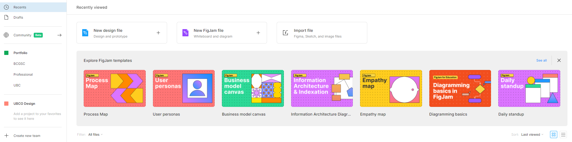
- Once Figma is open you will be greeted with the top screen above. From there, for designing or prototyping you can hit create a new design file or you can create a FigJam file if you want to do a whiteboard or work with diagrams
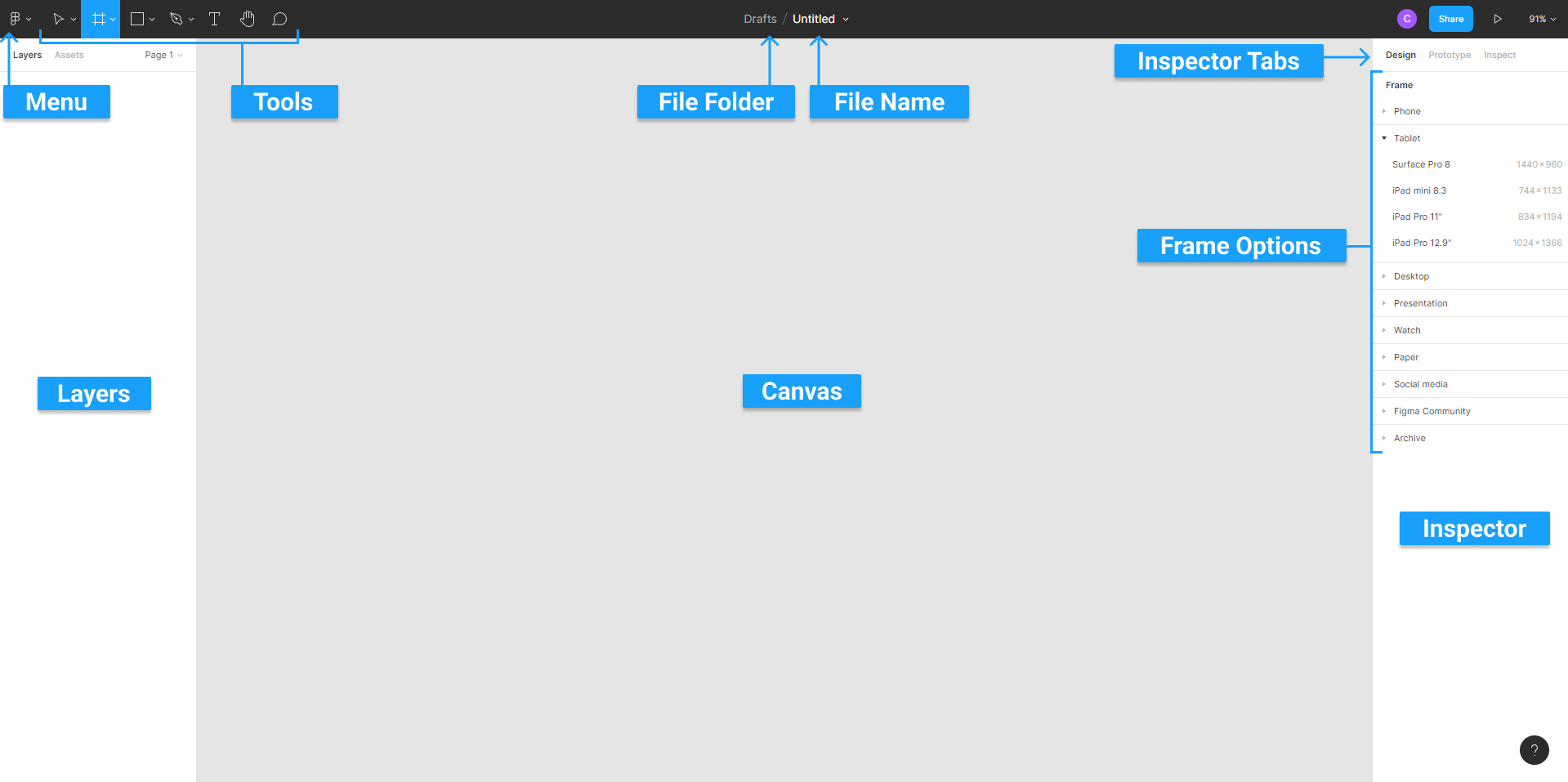
- For a Figma design file you can take a look around the Figma interface as seen above with labels
- Menu: explore to see all the options menu has to offer. For example, you can use the quick action search to find things
- Tools: On the top bar beside the menu we have the tools
- First, the blue tool is the move tool and in the drop-down you’ll also have scale
- The frame where you can draw out a frame or select one from the inspector design tab. Then there is a slice within the drop-down
- Then we have the shapes drop down; initially rectangle is selected but we can select line, arrow, ellipse, polygon, star, and place image
- Then we have the pen tool similar to the Illustrator and photoshop pen tool and the pencil tool
- Then we have the insert text tool
- Hand tool to move around the canvas
- comment tool to give suggestions to team members etc
- Title: Title of design file
- Layers: This is where every element in the file is listed, organized into frames and groups
- Canvas: This is where you create your project
- Inspector: Which consists of three tabs design, prototype, and inspect
- Design: when a frame is selected it shows all the frames you can insert. If you have an object selected you’ll have more options like: aligning, object and frame placement along with width and height as well as the degree and if there are rounded corners. There is also an auto layout, layout grid which can be used for helping design by adding the 5 columns you see in mobile. Then you have the layer section. The fill section is where you can choose the colour opacity of if it’s currently hidden. You can add a stroke to change its color, opacity, thickness and where it’s located on the inside. Then you can add effects: there is a drop-down of options like drop shadow, inner shadow, layer blur, and background blur. To the left, you have a more info button that looks like a sun. From there you can change in drop shadow the x, y, the blur, spread, and opacity. This changes based on which one you have selected.
- Prototype: prototyping is its own other section of Figma and what it has to offer so ill leave this one for you to research about when you get to those steps in CSS/IOS/Android. You could look at a whole frames inspect or just a single component like a button.
- Inspect: This is where you can grab your code snippits
- Now that you understand the interface more let’s create your first frame:
- Select the frame tool. From there you can draw out the shape of your rectangle on the canvas or you can select one of the options from the interface design tab like desktop or social media asset.
- How to zoom in and out: You can use ctrl or command in mac plus your mouse scroll wheel. You can also use the plus or minus symbols on your keyboard. Shift plus 1 will zoom out to show the whole used canvas. Shift plus 2 will zoom to the current selection. N will zoom in to the next frame and Shift N will zoom in to the previous frame.
- You are able to explore your canvas using the hand tool. This can be done by selecting it within tools or by holding the space bar which will have a hand icon pop up. Then click and drag yourself around the canvas. Mac trackpads can do this by dragging two fingers on them.
How to videos
- Figma’s Youtube Channel
- Learn Figma for UX/UI Design master courses by Selfstudy Space
- Figma Tutorial - A Free UI Design/Prototyping Tool. It’s awesome. by DesignCourse
Do you have any questions? Feel free to contact us at [email protected] or on Twitter at @distribgenomics.